

SEO web design involves creating and constructing sites that the search-engine friendly. Making a site SEO-friendly ensures that Google & other search engines can scan each site page, read the information correctly, and index it in their database.
Once indexed, businesses may then deliver the most relevant and helpful web pages to their visitors, depending on the subjects they search for. The better the SEO tactics and the more an SEO team is incorporated into the web designing process, the greater the possibility of indexation and ranking the first page of the search results.
Because only a tiny fraction of the millions of individuals who use search engines every day look beyond the first page of Google’s search engine results pages (SERPS), it’s crucial that you create and build an SEO-friendly site to boost organic traffic and earn 1st-page rankings in Google.
When Building A Website, Why Is It Crucial To Make It Search Engine Friendly?
By investing in SEO, firms can extend their reach across relevant target groups and be discovered at an essential point of the customer’s journey – the purchase. Additionally, paired with content marketing or blogging, SEO helps you establish and expand your brand by providing top-of-funnel material for people still in the earliest phases of the purchasing cycle. The advantages are evident. But how can you get there? Let’s look at just how you can make the website SEO-friendly.
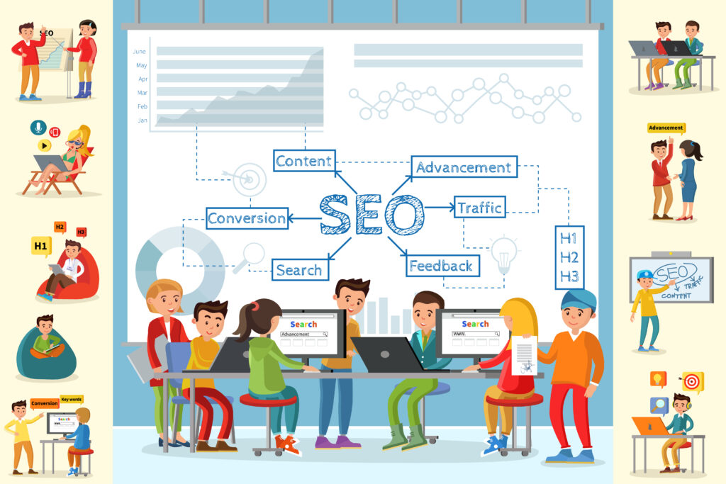
Heading Hierarchy
It is crucial to ensure that every one of your websites starts with a “Heading One”. Make sure to have included the keyword phrases inside the headline. The heading following a “Heading One” must always be a “Heading Two.”
If “Heading Two” or “Heading Three” appear in your website’s design, it indicates that you’ve included the subhead “Heading Two,” and the subheadings should be set up as paragraphs. By doing it in this manner, you can ensure that the standard heading order is maintained. It is recommended that from this point on, the remainder of your website’s headers be designated as “Heading Three,” “Heading Four,” and so on.
Reach Out To People Who Are Using Mobile Devices By Using A Responsive Design
It might be challenging to determine which aspects of SEO-friendly website design are most important to your company’s success. A responsive design is one of the crucial elements that can propel your company to victory. You need to use responsive design if you want your website to perform well in search engine rankings.
A responsively designed website must automatically resize itself to accommodate visitors using a wide variety of devices. The optimal version of your site will be sent to visitors regardless of whether they reach it from a mobile phone, tablet, or desktop computer. Which begs the question: why is responsive design such an essential component of search engine optimization-friendly website design?
Your website must be responsive to look well on all devices, which means it needs to accommodate displays of varying sizes. Users accessing your site from mobile devices will only be happy if you make adjustments for them.
Just picture yourself using a mobile device to visit the desktop version of your website. In this case, your site would be shrunk to an unacceptable size. It would be difficult for users to see the text, see the photos, and access the links. They will not have a good time watching this. If your audience is not engaged within a few seconds, they’ll depart and go to a rival with better-optimized web design.
You want visitors to stick around on your site for as long as possible since it gives an excellent signal to search engines. If Google thinks your site is related to the user’s search intent, it will promote it in the search results.
Websites optimized for search engines are more likely to retain visitors for longer, which improves the site’s position in the search results. Incorporate responsive design into your website’s layout to make it more user-friendly. The more time potential customers spend on your site, the more you’ll benefit from using SEO best practices.
Make Your Site’s Structure Search Engine Friendly
When thinking about how to make your website more search engine optimization (SEO) friendly, the structure of your site is a crucial factor. The readability of your site to search engines is influenced by the level of hierarchy you use on your pages.
Only some sections of a website will hold greater weight than others. Google would like them to be laid out in an “intuitive” fashion, making sense to both robots and humans. Thus, this relates to the first point made here, you should make a visual plan that maps your website before you begin making or rebuilding it.
Creation Of A Mobile-Friendly Interface
Mobile-friendliness is a significant factor in organic search engine rankings. The reason being Google or other browsers are aware that a substantial number of consumers now utilize their mobile devices to do online searches. It will only rank well if users have a good time on your site when using a mobile device.
Help Search Engines Find And Index Your Content By Connecting It
Keep internal linking in mind as you gain knowledge on optimizing your website for search engines. A crucial aspect of search engine optimization is internal linking. By doing this, search engines can find and index, your site’s latest content.
Google may need some of the best pages on your site, which include significant material. Default by Google will index only some pages on your site, so you will need to make it easier for them to do so. Because of internal links, Google is aided in finding these sites and indexing them within search engine results.
Do it right if you want to utilize internal links on the site. Adding links to the pages randomly differs from how you want them indexed. The content and anchor text used on the page should be a good fit for the linked resources.
Include The Most Crucial Links In The Main Navigation
Consistent with the last point, it is crucial to analyze the structure of your website’s menu on both desktop and mobile versions.
Over the last several years, SEO has been a discernible shift toward focusing on how to serve the user best. This means that search engine optimization and user experience design are increasingly converging.
Conclusion
If you are not developing your website yourself, make sure that your developer is adopting on-site SEO Darwin best practices so that you may provide your customer with the excellent website possible based on your ideas.